NCR has put down efforts to make their interactive kiosks accessible for all users including people in wheelchair or visually-impaired. Therefore, they were seeking for a new update on their existing user interface to better incoporate with the existing accessibility feature their kiosks have -- uNav keypad.
Because of the defined physical design of the kiosk model, leveraging existing accessibility feature and creating new interaction methods is the key to imrpove ordering experience for wheelchair users.
OVERVIEW
PROBLEM

Thus, the design challenge is here:
How can the existing user interface interaction to be improved by utilizing the uNav keypad?
SOLUTION
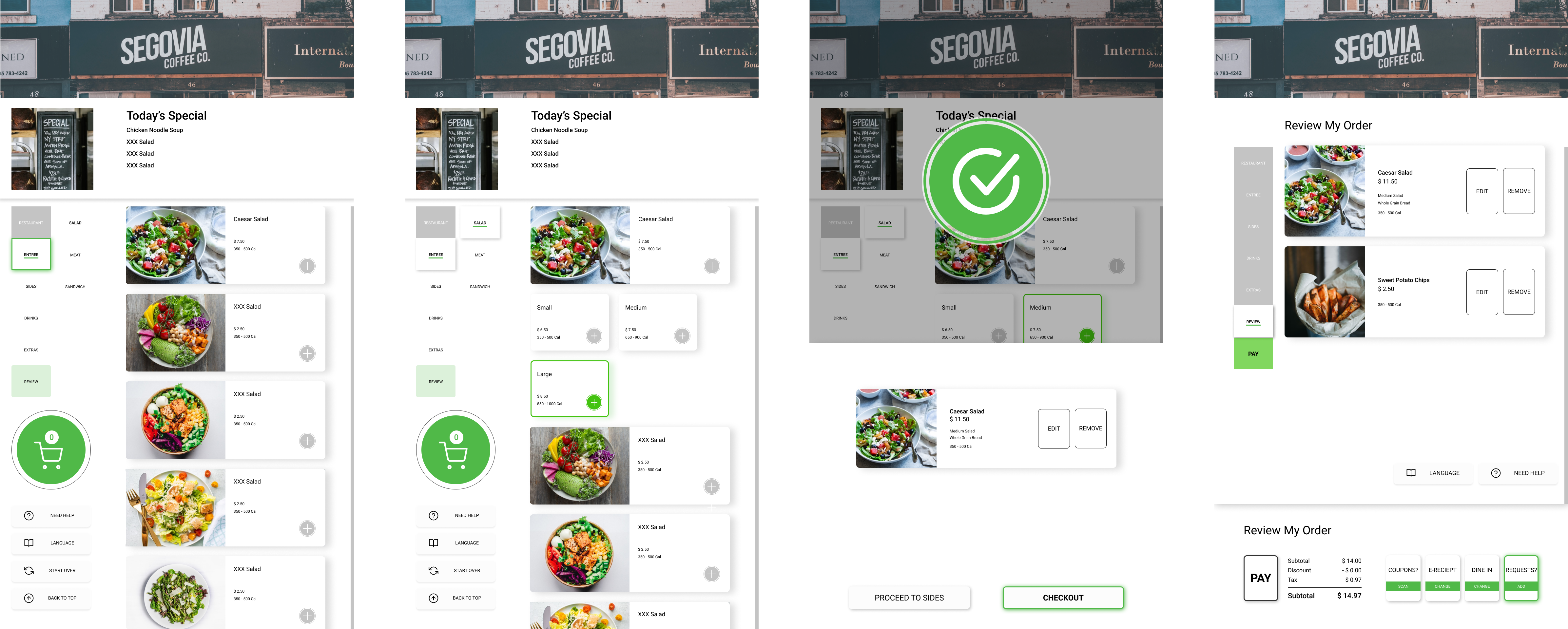
My team created a uNav compatible user interface with tab indexing system for button and action selection and fast movement within high levels of the system. These are the final design of the interface:

INFO
Time Frame
Key Words
My Role
Aug. 2019 - Nov. 2019
Accessibility, Kiosk, Food ordering
During the research phase, I planned and conducted field observations, created online survey and usability tests for traget users and field experts.During the design phase, I actively contributed in the brainstorming sessions and created wireframes, storyboards, high-fidelity user interfaces. I also revised the user flow and built an interactive prototype within Figma.
PROCESS

RESEARCH
In order to identify what common points of frustration and difficulty they with interactive kiosks (and more generally, digital technology), and, perhaps most importantly, resulted in an informed design direction for the next part of this project, the team organized a series of three qualitative research efforts:
- Field Observation and Task Analysis
- Online Survey
- Semi-structured Interviews
FIELD OBSERVATION / INTERVIEW
My team observed internal employees interacting with the XK32 kiosk with uNav keypad installed and we break down all actions recorded into sequences of tasks. We discovered that the ordering process was significantly more complicated to accomplish with the external keypad. The current user interface limited the keypad interaction by creating a mouse moving on the screen to help select instead of touching the screen, which almost tripled the time for self-ordering.
With information we gathered from background research and field observation, we engaged several potential users with questions about their previous experience with interactive technology and potential obstacles. After in-depth interviews with users, we discovered that most of them had no experience using any interactive technology in public and were not willing to try because of difficulty. And all of them believed that the existing technology were not efficient enough for them to try self-ordering instead of asking people for help.
SURVEY
After having a basic understand of how wheelchair users interact with self-ordering technology, (and in the constraint of limited target users we could find in-person in the time frame) we launched a survey with questions about their preference and experience about public interactive technology in general to help us form a clear design direction.
According to our survey, most of our target users have not encountered any useful accessibility interactive technology in public. And most of them believe accessibility technology is useful but incorperated poorly with existing system to provide specific interaction for people in wheelchair (sometimes is the physcial space or machine, sometimes is the interface design).
SYNTHESIS
My team processed large amount of diverse qualitative data from interview and survey together and performed affinity mapping to discover pain points related to different stages throughout the ordering process.

We created a design implication table to ensure that our design solution accounts for the differet user attributes for the variety of associates that physical limitation, reach range, and environment.
We also created personas and empathy maps to represent different groups of users by advocating for true end users that we intended to design for.


DESIGN
With a clearly defined problem, the target users, their needs and pain points, we brainstormed potential features that would help address the problems. While we valued creativity, we also wanted to ground ourselves to the feasibility of the solutions and our ideas are not only for wheelchair users, but for all users to enjoy.
Since we have decided to focus on improving existing system to work better with external accessibility components, we generated three design concepts varied in focus that could help encourage people with physical disability to use the self-ordering kiosk and enjoy the experience. We then sketched each idea and delivered them to experts for feedback.
IDEATION
Users will have access to a web page on their cellphones where they can save personalized information and disability setting and to customize GUI setting for all interactive machines. The kiosk will access those information through NFC chip.
Easy to set up
Reusability
Personal customizability
Hardware requirements
Flexible GUIs with presets

The updated interface will have a uNav compatibility mode that is easy to control with uNav keypad. There will be a grid that help users to navigate through the whole ordering process with direction buttons on keypad.
Easy to use
Different modes for users
No hardware requirements
Whole new UI system
Physical limitation

The ordering process will have preset tooltips available to help users in general to proceed, including pop-up information about how to access uNav keypad and other available accessibility features.
Useful in general
Easy to use
Limited help on accessibility
Complicated interface

FINAL DESIGN CONCEPT
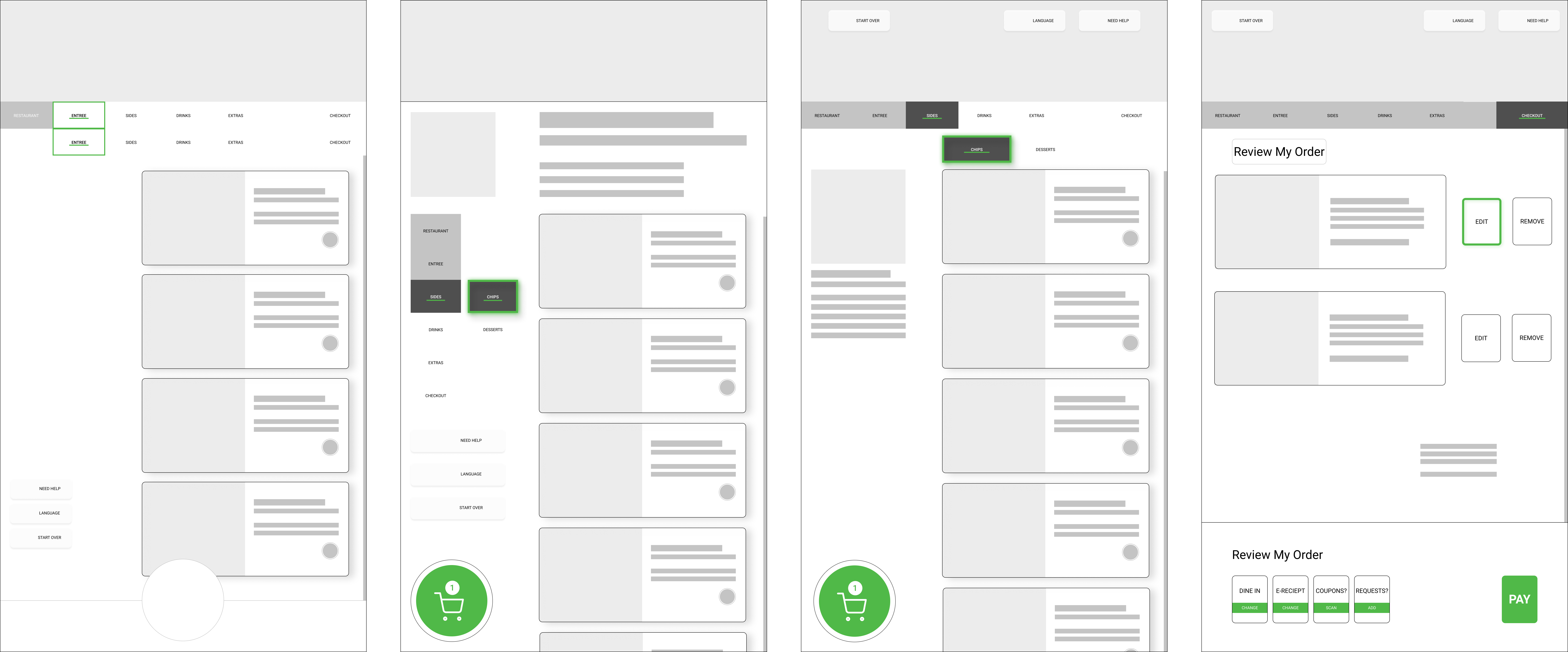
Our solution provides two sets of user interface with one with tab indexing system that can operate efficiently with directional buttons from external keypad. It would significantly shorten the time it took to order for wheelchair users with accessibility keypad.
WIREFRAME

FINAL PROTOTYPE

EVALUATION
USABILITY TESTING & NEXT STEP
We made some small iterations of the prototype between the expert evaluation and the user usability testing to optimized the feedback and testing results. User usability testing was designed to be 2 distinct tasks that ask users to order certain items from the menu and modify their order. The goal of usability testing was to gather behavioral and attitudinal feedback with after-session rating questionnaire. From the two testing sessions, we synthesized all the findings into design recommendations where we could move forward to interate the project, including:
- Improve parent-child menu visual hierarchy
- Incorporate a “back” button or similar function
- Decrease use of green color throughout system to emphasize highlighted elements better
- Refine visual linear relationships between interactive elements
- Emphasize or add system status indicators to display order progress

Check out My Resume here, and please feel free to reach out if you'd like to chat!


